The second part of my coursework evaluation is in the form of a prezi, it can be viewed on the link below:
http://prezi.com/xogoiev1a3vo/a2-coursework-evaluation-part-two/
Tuesday, 5 April 2011
COURSE WORK EVALUATION - PART ONE
During my research into radio drama, I listened to various examples of celebrated radio drama. There was one that really stuck out for me, and that made the biggest impression on me, it was called ‘The Hitchhiker’s Guide To The Galaxy’. It followed basic conventions of radio dramas, with sound effects and theme music being used. It was their narrative structure however that broke free of the linear narrative pattern that most radio dramas follow. Of course, radio dramas follow linear narratives for a good reason. They are limited to one form of communication, and because the visual isn’t present, it can often be harder for people to understand what is going on.
‘The Hitchhiker’s Guide To The Galaxy’ followed a non-linear narrative as the characters went through different universes and different periods of time. Its concept may sound like it would be a difficult listen, making it less enjoyable. But the way it was done, made it so much more interesting as a radio drama. Listeners really have to immerse themselves in the listening process to follow what is going on. Through its complicated structure and science fiction elements, it expects more from the listener. But I found that this wasn’t a bad move, and even though it is complicated, it’s more entertaining because of it. The main story had a combination of realism; this was found mostly in the main character who is just a normal man, and fantasy science fiction which shaped the drama. Another concept was thrown in with the radio drama that went against the basic linear narrative structure even more. At certain points in the story, it would cut away from the main action and a section from the fictional book, that the drama shares its title with, would be read. The exerts would relate to the current situation of the characters. The book, the television series and the recent film are all very popular too. This just shows what the combination of a good story and cross-media convergence can achieve. The fact that the radio drama did so well up against the versions in more popular formats shows that it was a cut above the rest.
The drama had a direct influence on me when I was writing my own radio drama. I wanted something that people could relate to, but at the same time, I wanted it to have a fantasy twist. This was something that ‘The Hitchhiker’s Guide To The Galaxy’ pulled off so well. “Hitchhiker’s…” used sound effects to communicate what was going on, this made me focus more on what sound effects I would use and when I would use them . It showed me the importance of sound effects in radio drama. What I didn’t want to do however, was write a radio drama that was just the same as “Hitchhiker’s…”. I felt as though I could appeal to a target audience of my own age group. At first I thought that this would prove hard because modern teenagers utilize the internet and more modern technology to get entertainment rather than the radio. I decided that the best way to reach my audience was to write something that they could relate to. Because of web 2.0 among other things, modern audiences want to feel a part of media more than ever before. So to reach their level, I chose to write about teenagers doing things that teenagers do today. I also put in references to modern media practices such as social networking, and modern cultural practices such as raves. This way my target audience can relate to, and feel like they know my drama. It’s this knowingness that makes people feel more in tune with films and television programmes.
I did stick to a linear narrative however, I felt that I could make it entertaining enough without having to mix up the narrative structure. In terms of the basic story, I took a lot of inspiration from modern television dramas such as ‘Skins’ and ‘Hollyoaks’. These are both very popular amongst my target audience, mainly because the themes dealt with in them, relate directly to their audience. ‘Skins’ focuses heavily on drugs, binge drinking and raves. This is where I took the inspiration to include a gathering of teenagers, similar to a rave. ‘Hollyoaks’ deals with personal relationships and identity, which is what teen dramas focus on because it’s what effects teenagers the most. The teenage period in people’s lives is widely recognised as the time when a lot of confusion is felt towards one’s identity and relationships with other people. These themes are reflected in my drama. Blumler and Katz’s audience theory was something that I looked at, to help me get a grasp on why my target audience use media. I found that personal relationships and personal identity were the needs that my target audience could get from my drama. At the same time as writing something that my target audience could relate to, I wanted to challenge them. Another popular genre amongst young people is horror. The horror genre has even found its way into mainstream television and film through the popularity of “Twilight” and “True Blood”. They exist in a hybrid genre of their own which mixes classic romance and drama conventions with basic fantasy horror.
To keep up with the post-modern times, I wrote in a horror element that worked with the main narrative. My narrative structure followed Todorov’s ‘5 Steps Of Narrative. This is simply because that’s how most narratives work, and it’s the easiest way to communicate a story to an audience. I wanted my drama to be challenging in the way that it had: references to modern culture and media, a story that had multiple themes and a story that began as one thing, changed, then returned to the thing that it began as. This is referring to the way that it starts off as a drama with teenagers going to a big event, with slight horror themes being referenced. In the middle of the drama, things go more sinister and it switches to a more of a horror story. Then at the end of the drama, what it all is comes into question.
I have developed the classic social drama of radio dramas such as ‘The Archers’ to coincide with a younger, more modern audience. My drama focuses around a small group of people and their relationships with one another. I have used radio drama conventions through my use of sound effects to communicate character’s actions and surroundings. I have used Todorov’s narrative theories to structure my story. I have also used Blumler and Katz’s ‘Uses And Gratifications Model’ when thinking about how I can relate to and entertain my target audience. And I have challenged forms and conventions of real media products in a similar way to how ‘Twilight’ and ‘True Blood’ have.
When it came to making the advert for my drama, I stuck to the layout norms in regards to form and content. From looking at other radio programme adverts, the layouts were all very similar. The basic layout was text at the top, picture in the middle, text at the bottom. The most important text goes at the top (the title) and the other information tends to go at the bottom (the date and time of broadcast). I wanted to make a simple, bold advert that made a statement about what the drama was, without giving too much away. The poster sells the drama as more of a horror than a drama. This is because I wanted people to have this perception of it before they heard it. This makes the twist in the story even more un-expected. I used a lot of red to connote danger, passion and horror. The whole colour scheme was stark which made the red stand out a lot more. I wanted the red to stand out, and I didn’t want the advert being too busy or overloaded with colour. I went for the simple layout to make it more memorable.
The adverts for T.V series ‘Skins’ were very minimalist but they had an impact at the same as showing everyone what it was about. This was what I was going for with my advert. I also took inspiration from viral advertising in the way that they don’t give very much away but this still sell the product through the buzz and the speculation. This is why I included the tagline: “What possessed him to do it?” on the advert. It relates directly to the title of the drama and it also asks audiences a question that they don’t know the answer to. This rhetorical question makes them want to tune in and find out what he did, why he did it, who he is and generally what it’s all about. Using the one image of just one person also helps to heighten the mystery. Facebook is an element of the drama, and both Facebook and the Internet are two of the most popular cultural sites for teenagers (my target audience). And so, I decided to use graphics that relate to the Internet and computer screen graphics. I made the portrait pixelated. I then placed it in a square box to resemble a 'profile picture' from a social networking site. Then I added a mouse arrow, as if it's clicking on the picture. This invites audiences to tune in, like the cursor is and find out more. As for the white background, this was a risky move. But I wanted to keep it the same background colour as Facebook for authenticity. Although computer graphics have moved forward a lot and aren't as pixelated as they used to be. I wanted to give the poster a more retro feel, because this is popular with teenagers in modern fashion. Another convention I used was the quotes from the press. Most adverts for any form of media, use press quotes. Including opinion leaders’ thoughts is a good move for selling products. I made up a quote from a The Guardian review because they are one of the more highly regarded newspapers. Our target audience may not read that paper, but because of its status, its opinions are trusted by many. I also included the logo of the radio station we decided to broadcast it on. The logo helps sell the product in the way that audiences may already recognise it. And so I have used common conventions of advert layout and content to make my advert easy to understand and read, but at the same time I have attempted to challenge the forms and conventions of radio drama adverts. I have done so by taking a different approach and instead of giving a lot of information away; I have retained it and have asked questions instead of answering them.
I wanted my feature to essentially run alongside my advert in promoting my drama. I read a lot of magazines in my spare time and I have found that most features have a focus on a person, or group of people. Through this, whatever the person is involved in gets promoted. It’s often similar to a celebrity endorsement. I decided to focus my feature on a cast member from my drama. I made up both the questions and answers in a fictional interview with them. I promoted my drama through giving readers the actor's behind the scenes stories and what she thought about the drama. I set my feature to be released before the broadcast of the drama. So my feature can act as a momentum build up for the first airing. I tried to make the questions range from being about the actor to the drama. Through this style of writing, audiences become interested in the drama because they feel like they have an inside view of it. This relates back to the point I made earlier about audiences wanting to be involved in media more than ever. Also, media products are often consumed due to the popularity of the celebrities or actors involved in them. For instance people would watch something new that David Tennant is in because he is already popular for starring in Doctor Who. So by promoting the actor or the star of my drama at the same time as promoting the drama itself, more buzz is generated.
In terms of layout, I based it on the layout of Radio Times magazine features. This is because The Radio Times was where the feature would be published. It may not be the ideal place to reach my target audience, but it would reach a more mature audience that might still be enticed to tune in, despite it not being aimed directly at their tastes. Like The Guardian newspaper, The Radio Times has a respected reputation. I tried to make my feature as visual as possible. But at the same time, the feature had to be interesting enough for people to read and not just skim over the pictures. Because The Radio Times has various features in each issue, if mine was to be published, it would have to stand out and make people want to read it. I used some eye catching conventions that most features use. First of all, I made each first letter of each paragraph bigger than the rest of the text, and I made them the colour red. This is to invite people to start reading. The rest of the text is black with a white background; this was to keep in with the house style of The Radio Times. I also used another form that a lot of features encompass. This is using an interesting quote from the feature and blowing it up larger than the rest of the text. It is then strategically placed in amongst the main feature. This gives audiences a quick taster of what’s going to be in the feature and makes them want to read it.
I attempted to mix it up a little bit however by including a transparent image of my feature star behind the columns of text. It created an eye catching visual effect that kept in with the theme of my drama. She looks like a ghost, faintly visible behind the text. This also helps draw attention to the feature. In terms of the title of the article, I tried to make it work with the image by having the portrait under the word "under" and having the word "spell" stand out by making it a different colour to the rest of the text and spacing the letters out. This is the word that connotes the super natural themes in the drama. I decided on my main image because it's an action shot. The composition places the subject directly in the middle, the background isn't too distracting and the fact that she is laughing makes the feature seem like a fun read. I have used the conventions of Radio Times features to replicate their style to suite my feature. I have also used basic conventions of any magazine feature with my choice of content and images. I have tried to make it appeal to my target audience by giving a lot of focus to visuals. I have tried to challenge forms and conventions of features by being a bit more creative with my placement of images and text. I think if I was to do it again though, I would try and create more of an original layout design.
The plan for my advert and my feature was to have the advert released early on, months before the first broadcast of my drama to create a buzz. Then the feature would be a follow up, shedding more light on the drama, just before its release. Then the drama itself would be broadcast, hopefully generating a buzz and a demand for the rest of the series. The three pieces would overall combine to address the target audience by the advert telling them that the drama is going to be broadcast, getting them interested in it and creating speculation over what it is about. The feature would then let them know more about the drama, and the exclusive thoughts of one of the cast members, generating more excitement pre-release and making audiences feel as though they know it better. So after weeks of knowing little, they are finally let in on what it’s all about, this will then make them want to hear it. The drama itself is the main product, and hopefully it brings in an audience. Once the drama is heard, more publicity will follow, priming audiences for the next episode. Reviews of it in magazines and on blogs will appear, and a lot of free publicity would come its way.
Monday, 4 April 2011
BBC RADIO 7 - BBC RADIO 4 EXTRA
The station BBC Radio 7 has now changed to BBC Radio 4 Extra. This will mean that the logo that I have used on my advert will no longer be relevant. What the station will be broadcasting however, hasn't changed. It is still a good choice for us because it will continue to show drama and comedy to a high standard. Where the station was once aimed at a younger audience, after research was carried out they found that their audience was much more mature. And so Radio 7 has been scrapped and changed into an addition of Radio 4 which is a station with a more mature audience. This proves beneficial for our drama because it is aimed at a more mature audience and it isn't suitable for children.


Feature For TV Guide - Production Process
My tutor looked over my feature and gave me a few pointers. Basically, I needed to break up the text into a few more paragraphs because it had too much text lumped together. Apart from that he was happy. I then went on to finish my double page feature. It can be seen below:


Saturday, 2 April 2011
Feature For TV Guide - Production Process
I have taken screen shots throughout the production of my TV guide feature to show it's progress. At first I was certain that I was going to use the edited image of Teena from my test adverts. It fitted well with the layout, and was still effective as a striking image.
But as the production went on, I decided on using a full image. Because most of the features I looked at had a main image that was of the star in their surroundings. I chose a more appropriate image with my model working with her surroundings. It made the feature more visual. I still wanted to keep my original main image however, and so I incoperated it into the second page of my feature. I did this by editing the image in InDesign.
My first step was Object - Arrange - Send To Back. Next I clicked Object - Effects - Transparency and made the image faded enough so the text could be read. It also created an eye catching visual effect, that kept in with the theme of my drama. She looks like a ghost, faintly visible behind the text.
I included some basic conventions throughout production such as making the first letter of each paragraph large to catch the reader's eye. Another thing I made sure of was having the text in columns. In terms of the title of the article, I tried to make it work with the image by having the portrait under the word "under" and having the word "spell" stand out by making it a different colour to the rest of the text and spacing the letters out. This is the word that connotes the super natural themes in the drama.
With the colour scheme, I stuck to both the colours I used with my adverts and the colour scheme used in all of the Radio Times features I looked at. Black and white is the easiest to read, with black text over a white background. I stuck to this convention of features. But to make the feature specific to my drama, I included dashes of red to make it stand out. Red connotes certain themes included in my drama; passion, danger and horror/blood.
The decided on my main image because it's an action shot. The composition places the subject directly in the middle, the background isn't too distracting and the fact that she is laughing makes the feature seem like a fun read.


Friday, 1 April 2011
Feature For TV Guide - Writing
When it came to writing the feature, I had a clear idea of where I was going to go with it. I wanted to promote my drama through the feature, but I wanted there to be another element to it. From looking at other features, they focus on an actor or celebrity that is a part of the TV or radio programme. I decided to make my feature an interview with one of the actors in my drama. I made up both the questions and answers. I promoted my drama through giving readers the actor's stories of behind the scenes and what she thought about the drama. I set my feature to be released before the broadcast of the drama. So my feature can act as a momentum build up for the first airing. I tried to make the questions range from being about the actor to being about the drama.
Wednesday, 30 March 2011
Feature For TV Guide - Layout Ideas
I have been looking at the forms and conventions of features in TV guides. I have come up with a rough sketch for the intended layout of my own feature. The Radio Times is the magazine I have taken most inspiration from because achieve a good balance between text and image. I will be aiming my feature at teenagers (my target audience) and so I will need to take into consideration what appeals to them. The visual impact of the feature will have the most importance. So my pictures need to be bold, and take priority. The feature as a whole will need to be eye catching to make people want to read it. The text is important, but the layout of the text is more important.

This was the first sketch that I came up with for my feature. I have made the picture the centre point and placed the text in a conventional and easy to read format. The only problem seems to be that the main picture will be cut in half by the split in pages. So I tried to stick to a similar format, but compensate for the two page spread of the feature.
I want the text to work around the outline of the image. This makes the feature more interesting to look at rather than blocks of text and block images. The image will be a portrait of one of the cast members. I'm going to make up the interview. I will also include small photographs taken in a behind the scenes style. This will help break up the text on the second page of the feature.

Tuesday, 29 March 2011
Radio Drama Advert Facebook Poll


To get some feedback from my target audience, I uploaded my radio drama advert to Facebook and asked for people's thoughts. I received feedback very quickly and the response was generally positive. Some people didn't appear to understand what I was aiming for in terms of design, but others did. I got quite a mixed response. I am going to leave my advert up on Facebook, so any future feedback can be received.
Monday, 28 March 2011
FORMS AND CONVENTIONS OF TV GUIDE FEATURES

I have chosen to base my study of the forms and conventions of TV guide features on a feature from a Radio Times article.The Radio Times is a highly regarded TV listings magazine. It aims to appeal to more adult readers, both male and female with it's intellectually high narrative style of writing. It writes in a way that can easily be understood, but at the same time, it is clear when reading it that a more mature audience is the target.
In terms of the images used, there is usually one main picture that takes up a lot of room on the double page spread. It is specific to the subject of the article. Other smaller pictures are included as little inserts. These are often related to the interviewee in a different way from the main article, they may relate to answers given by the interviewee. What they mainly help to do is break up the text, because Radio Times articles are always quite word driven. The Radio Times also include small portraits of the people who wrote the article next to the key information about the related show. This makes readers feel more in tune with the magazine and what they are reading. Another clever detail I have noticed is the way they include an image of the DVD case if the article is about a TV show being released. This adds to the extra visuals and could be a promotional technique of the people releasing the DVD in conjunction with The Radio Times.
The text layout sticks to the standard magazine format of text in rows. At the beginning and end of the article are little blocks of information. At the beginning is the name of the programme that the article is the subject of, alongside the date, channel and time of broadcast. The main article follows then at the end there is sometimes a competition offer. This is something that I could consider for my feature. The biggest piece of text is a line that entices people to the feature. It can sometimes be a quote from the interview. Below this line is a synopsis of the article, who/what it's about and who has written it.
In interviews, the writer often refers to how the interviewee behaved and how they said what they said. It helps readers to visual the interview, makes it feel more like they were there. Sometimes memorable quotes are re-printed larger in the middle of the article to make the article stand out more or to attract reader's eyes. A description accompanying each image is another key element. This makes sure that readers have information on everything.
The main way that the articles promote the radio drama or TV drama is through the interview with the person related to it. This allows readers to get a behind the scenes view of the drama and get a positive view of it from someone was directly involved. It also helps to create a buzz if the person is a celebrity or a famous actor. What the articles do best is to make people feel as though they are getting a direct incite into how the drama was made. And they can get exclusive comments from the stars, this all adds up to a good impression being made. Because of the way technology has progressed, people feel like they need to be more involved with media to truly enjoy it.
Wednesday, 23 March 2011
Radio Drama - Audience Feedback Statistics
Out of the 26 people in the audience:
Problems / Dislikes
19% thought that some of the sound effects were unclear.
76% thought the audio levels needed changing.
38% thought that the storyline was unclear.
7% thought that too much was happening in the drama.
Positive Feedback
23% people liked the use of sound effects.
50% thought the story line was good.
15% thought the music was a good addition.
7% thought the acting was strong.
Score Out Of Ten
MALES
1/10
2/10
3/10 - 1
4/10
5/10 - 4
6/10 - 3
7/10 - 4
8/10 - 1
9/10 - 1
10/10 - 1
FEMALES
1/10
2/10
3/10
4/10
5/10 - 1
6/10 - 1
7/10 - 4
8/10 - 2
9/10 - 3
10/10
From this feedback, it can be seen that the main issues our audience had with the drama were the audio levels, the storyline and the sound effects. I think that our drama has got a lot going on in five minutes, but we were trying to make it as entertaining as possible. Which I think we have achieved from looking at the scores. The females in our audience seemed to be giving it higher scores than the males. This may be down to the main characters being Teena and Zane who are in stange relationship involving Facebook. Overall we are happy with the feedback we have received. It is generally positive, and we now know where we can improve it.
Tuesday, 22 March 2011
Newspaper Advert - Feedback / Idea Re-Think
My tutor looked over my newspaper adverts. He gave me a few areas to work on, and he raised a few questions with them. First was the white background, I had thought that it would make the contents of the poster stand out, but he said that there is too much white space. I can see where he is coming from. Black would be a more appropriate background colour: it fits in with the genre and can still make the advert stand out without seeming too blank. He then questioned why I had a girl on the advert, accompanied by "what possessed him to do it?" which doesn't make sense. I now think that I will stick to the Zane advert and not have the two different ones. The Zane advert was the one that he preferred out of the two, the only problem he saw was the effect I used on Zane's shadow copy. He said to try and make it look less tacky and more realistic. The final point he gave was that to use up more space on the ad, I should add in quotes from reviews. This is a common convention of any media product advert.
From hearing my tutor's comments, I decided to re-think my ad. I felt that it needed more of a theme. Facebook is an element of the drama, and both Facebook and the Internet are two of the most popular cultural sites for teenagers (my target audience). And so, I decided to use graphics that relate to the Internet and computer screen graphics. I edited the Zane portrait and using the Mosaic Pixel Filter, I made the portrait pixelated. I then placed it in a square box to resemble a 'profile picture' from a social networking site.
Then I added a mouse arrow, as if it's clicking on the picture. I stuck to the original colour scheme of red and white because red connotes horror, blood and danger. White is the background colour for Facebook. I wanted that element to stay, because I tried out black as a background and it just didn't work. It came on a little too strong. I want the image and text to be the focus, not the background colour. I also used slightly pixelated fonts.

Although computer graphics have moved forward a lot and aren't as pixelated as they used to be. I wanted to give the poster a more retro feel, because this is popular with teenagers in modern fashion. I made up a quote from a The Guardian review because they are one of the more highly regarded newspapers. Our target audience may not read that paper, but because of it's status, it's opinions are trusted by many.
I have tried to fill up more space like my tutor said I should, and I have improved the image and general concept of my radio drama advert. I have still kept with the minimal yet bold style that I was trying to achieve. The finished advert can be seen below:

To reach the target audience of our drama, we would need to get the advert published in modern magazines that are popular with teenagers and young people. An example would NME, which is a good music and entertainment magazine. To reach the right audience we would need to have it published in relevant magazines such as The Radio Times. As well as newspapers with a more balanced view and a more regarded reputation such as The Guardian. But the best way to reach our audience would be to use cross media convergence and use the adverts on Facebook and other social networking sites. Through using these sites we can reach a more specific audience through methods such as behavioural advertising.
The other members of my group also made adverts, they can be seen below:


Newspaper Advert - Production

I started work on my Zane character poster by using Quick Selection to cut him out, then I added the same filter as I had done with the Teena poster. I used the same layout as the Teena one, but I decided that I would make the Zane one different and a bit more sinister because he is the villain in the drama.
I made a copy of the cut out figure and rotated it horizontally, then I began adding different filters. I found a shadow filter that changed the colour of the portrait and added a dark glow.

I opted for the colour red for the glow, to connote blood and danger. It looks more eye catching too.

From here, I added it to the original poster layout. I placed it behind the bright portrait of Zane, it looks almost like his shadow. I wanted this to connotte the fact that he says he is possessed in the drama. But it doesn't give away whether he actually is or not, which is the twist in the tale. It's also following the convention that villains have two sides to them.
I decided to stick to the two main characters for my ad campaign because they are what the whole episode revolves around. I also have the balance of one girl and one boy to appeal to more people in my target audience. I think the ads will attract the attention of my target audience, because they are simple, bold and they use modern technology and modern people (the models). The final versions can be seen below:

Teena

Zane
Monday, 21 March 2011
Newspaper Advert - Production
Before I started work on InDesign with my original idea, I came up with a better concept for my newspaper advert. The idea I came up with looked more like a film poster than a radio drama advert. This new concept that I'm going to run with follows more of the conventions of the radio drama ads I looked at in my research.
Basically, the date and time of broadcast will be at the top of the advert, accompanied by the radio station logo. In our group we decided on Radio 7 because it broadcasts the most drama and comedy, and is a BBC radio station. BBC radio stations reach wide and varied audiences across the world. After the information comes the title of the drama. This is following the basic convention of having the text in an easy to read order from top to bottom. I chose the font "More Than Human" from Dafont.com because I felt it was the most striking and best fitted to our drama's genre. I downloaded the font for free and installed it on my computer.
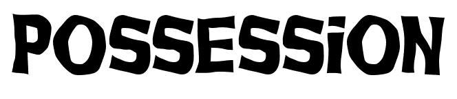
I decided to come up with a tagline for the radio drama, this isn't a usual convention of radio drama ads, but I added one to make it different. I included on the ad the rhetorical question: "what possessed him to do it?". This makes viewers of the ad ask themselves the question and the only way to find out the answer is to tune in. It also adds mystery to the drama.
After the title comes the main image. From the ads that I have looked at, it's usually one image, in the center of the ad. I have decided to use a portrait of two of the main characters that the drama centers around: Teena and Zane. I have made two different ads, one with Teena as the main image and one with Zane. I decided to use the test shot of Teena that I took because it came out really well. But I re-took the Zane portrait to get a better image. I decided to put the portraits against a white background to make them stand out a lot. The white background will make all the features of the ad stand out. It also adds more mystery by only giving viewers the text and the image to give them an idea of the drama.
I opened the photograph of my model for Teena in Photoshop. Using the Quick Selection Tool, I highlighted her and then cut her out.
I then blurred the edges of the portrait to take the edge off of the cut. From here, I started experimenting with different filters to add a spookier edge to the portrait.


I eventually decided on the filter seen directly above in the screen shot. It makes her look ghostly, mysterious and gives the ad more edge than just a simple portrait. Then once I had finished with the portrait, I began putting my ad together in InDesign, following the layout I had decided on. I found the Radio 7 logo using a google images search.

Once I had completed my ad, I exported it as both a PDF file and a JPEG file.


Basically, the date and time of broadcast will be at the top of the advert, accompanied by the radio station logo. In our group we decided on Radio 7 because it broadcasts the most drama and comedy, and is a BBC radio station. BBC radio stations reach wide and varied audiences across the world. After the information comes the title of the drama. This is following the basic convention of having the text in an easy to read order from top to bottom. I chose the font "More Than Human" from Dafont.com because I felt it was the most striking and best fitted to our drama's genre. I downloaded the font for free and installed it on my computer.
 |
| Installing "More Than Human" Font |
I decided to come up with a tagline for the radio drama, this isn't a usual convention of radio drama ads, but I added one to make it different. I included on the ad the rhetorical question: "what possessed him to do it?". This makes viewers of the ad ask themselves the question and the only way to find out the answer is to tune in. It also adds mystery to the drama.
After the title comes the main image. From the ads that I have looked at, it's usually one image, in the center of the ad. I have decided to use a portrait of two of the main characters that the drama centers around: Teena and Zane. I have made two different ads, one with Teena as the main image and one with Zane. I decided to use the test shot of Teena that I took because it came out really well. But I re-took the Zane portrait to get a better image. I decided to put the portraits against a white background to make them stand out a lot. The white background will make all the features of the ad stand out. It also adds more mystery by only giving viewers the text and the image to give them an idea of the drama.
I opened the photograph of my model for Teena in Photoshop. Using the Quick Selection Tool, I highlighted her and then cut her out.
 |
| The portrait cut out from the background |


I eventually decided on the filter seen directly above in the screen shot. It makes her look ghostly, mysterious and gives the ad more edge than just a simple portrait. Then once I had finished with the portrait, I began putting my ad together in InDesign, following the layout I had decided on. I found the Radio 7 logo using a google images search.

Once I had completed my ad, I exported it as both a PDF file and a JPEG file.


Thursday, 17 March 2011
Newspaper Advert - Test Shots
The basic idea for my advert, is to have a portrait of Zane at the center of the poster, he will be pointing downwards with both hands at the two other main characters of Teena and Andy. This is to connote his influence over them. Then above Zane, and just below the title, I will have a large image of an arm pointing. I will edit this on Photoshop to make it seem demon like. This is to connote that Zane is saying that he is possessed, and the arm represents the possession. I have taken some test shots for my first advert idea. They can be seen below.
This is my first image of Zane, using Photoshop, I will cut him out of the picture from the torso. I will then drag and drop the cut image into InDesign and play around with sizes to see what fits best. I will be doing this with all my images until I am happy with the layout.

Below is my Teena test shot. This photograph is the one I am most proud of. Her expression and body language are really striking. This image draws you in.
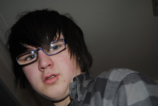

My test shot of Andy is quite close up, I wanted them all to be different images to make the advert more diverse. However, I may take further shots if these shots don't work out on the advert.

And my final test shot, is of the possession arm.

Tuesday, 15 March 2011
Newspaper Advert - Ideas Development

Above is my first sketch idea for my advert. I want it to be based heavily around the title and the photographs. These will be the main features of my advert. I had a look at fonts on dafont.com to see what would fit the mood and style of the drama.
This font has quite a retro feel to it. It reminds me of the Scooby Doo cartoon. It still has some menace to it though, with it's slightly wobbly edges. It's bold and I think at the same time it connotes horror.


Monday, 14 March 2011
Newspaper Advert - Brainstorm Of Ideas
Myself and my group went through a thorough brainstorm of what each of us wanted to achieve with our individual adverts (which can be seen above). I then went into detail about the title of the drama, which will be the most important aspect of the advert, followed by the photographs.


Friday, 11 March 2011
AUDIENCE FEEDBACK
We had a feedback session where all the groups got together and we listened to each others radio dramas. We also had an outside audience of teenage girls and boys around the same age in to get extra feedback. This was useful for us, because they were all from the age group of our target audience. A comment sheet was filled out by each participant. This allowed them to outline what they liked/disliked about the drama and what they thought could be improved.
The main issues raised with the storyline were:
The ending being a little confusing.
The fact that one of the main characters goes from being sceptical to being converted too quickly.
The main issues raised with the sound were:
The middle section of dialogue is quieter than the rest of the drama and lets it down.
The volume levels at the end make it hard to understand what is going on.
The feedback we received was mostly positive. Our target audience preferred our drama over all the others. This was very encouraging to hear. The most raised issue was the volume levels of the dialogue and sound effects. Another problem was that quite a few listeners found that the ending of the drama was confusing and they weren't sure what had happened. This was down to our choice of sound effects, and so we can easily amend it. One aspect that appeared to polarize opinion was our decision to use repetitive dance music as background audio during the gathering scene. The older members of the audience found it too repetitive and intrusive. But our target audience liked it. Dance music is supposed to be repetitive, and we had to go with our target audience's opinion. Other positive feedback was that people liked the storyline. A few commented on the way the story was easy to follow, others said they liked the modern feel and references to current culture. One comment was that one of the main characters goes from being sceptical to being converted too quickly. This was something we were already aware of and made ammends to. We only received the comment from one listener, who wasn't part of our target audience. So we don't see it as a main issue but if we have time, we may add in some dialogue to make it more realistic.
From our feedback we now need to make the following amendments:
Change the volume levels throughout the drama.
Change the sound effects at the end to make it clearer as to what is going on.
Monday, 7 March 2011
FORMS AND CONVENTIONS OF RADIO DRAMA ADVERTS
Because radio dramas aren't as mass produced as films are these days, it is rare to see adverts for radio dramas in the outside world. They are however, used on websites and printed in magazines such as The Radio Times. Because radio dramas are audio media products, it is harder to promote them visually. A solid visual image is needed to communicate directly what the drama is all about. Before I start production on the advert for my radio drama, I need to look at some examples to gain a good idea of the conventions of radio drama adverts.
 I came across this poster and originally thought it was a film poster for Star Wars because it follows a similar structure. But through studying it further, the fact that it's for a radio drama soon becomes clear. The image is of an important and recognisable character in the drama. It takes up most of the poster, and the character combined with the background gives viewers a clear idea of what the drama is going to be about. Each section of the poster follows on from the other, in a straight line. This makes the poster easy to read for viewers. The name of the drama is bold, eye catching and clear. It's closely followed by "Exclusively On Public Radio" which lets people know that it's going to be broadcast on radio. It also aims to get people excited by this fact. Following on from the three main elements (the image, the title, the tag line) is the important information about when it's being broadcast and on what station. Overall this poster is very well made, it's precise, clear and bold whilst still remaining informative.
 This isn't an advert for The Goon Show, it's the cover for the CD format of the radio drama. It still has the job of selling the drama however. It has a very simple layout, but it still communicates what's needed. The photographs of the characters grab the attention, they also give a visual idea of the characters in the drama. So when people listen to the drama, they can picture these characters. The title is clear, bold and colourful and the rest of the required information is easy to read. The layout is also well composed and the whole piece communicates precisely what it should.

This BBC radio drama is a different genre, but the layout is very similar to that of "The Goon Show". This is partly down to BBC's apparent house style. The main image is the signifier that this drama has a science fiction theme. This is due to the futuristic technology theme. This also has a catchphrase as a predominant part of the layout. It's good to establish a phrase to go along with a radio drama because they are word based forms of entertainment.


Thursday, 3 March 2011
RADIO DRAMA - Progress
We have decided on a final version of our drama. We are very happy with it but to make sure; we are going to be playing our drama and receiving feedback from various listeners. This will give us an idea on whether we have made a connection with our target audience, how good our drama actually is and how it all sounds. Further editing may be needed after the listening and feedback session, but for now we are happy with the drama we have made. I exported the final file as an mp3 file using Soundtrack Pro.


Below the final version of the drama can be heard on Youtube:
Tuesday, 1 March 2011
Monday, 28 February 2011
RADIO DRAMA - Editing Process

In this session I concentrated solely on audio levels. To do this, I selected the audio section, then clicked PROCESS - ADJUST AMPLITUDE and I turned up or turned down the audio according to the piece as a whole. Whilst I was doing this, the other half of the group was working on Zane's voice sounding possessed using the Pitch Shifter tool.
Thursday, 17 February 2011
RADIO DRAMA - Editing Process
I continued my work on adding distortion to Zane's voice. The section I was editing had two different character's dialogue in it. When I first tried to add distortion effects to Zane's voice it did the same for all the dialogue. To get around this I added a new track and using the cut tool cut out Zane's dialogue and dragged it into the new track. I had to make sure it was in line with the other tracks of dialogue. Using the new track, I added distortion to Zane's voice without it affecting the other dialogue. Below is a screen shot with the new track highlighted:

Another element I decided to add that we had previously overlooked was the use of scary music to add tension. Horror films always use it and it's a key convention. I decided to add it as a build up to the point where Gus scares Andy. The music suggests that something horrible is going to happen and thus builds up false tension. This is another key convention of horror films, they build up tension around points that could potentially be scary but end up just being something normal. This keeps audiences on edge. I chose a track that had a direct build up. A screen shot of the "scary" audio can be seen below:

You can hear the tension build up track on the link below:
http://www.youtube.com/watch?v=v-r_vLYaaP4
Monday, 14 February 2011
RADIO DRAMA - Editing Process
We have been taking it in turns to edit the same Soundtrack Pro file to keep the project all in one piece and to make it easier for us all to have a continuous say in the editing process. Whilst looking through the script during editing, we realised that some sound effects that we had thought about adding weren't needed or made it hard for the dialogue to be heard. I went through the script and highlighted the bits that we decided to leave out. In this session I worked on adding distortion to the vocal of Zane to make it sound like he is speaking through a megaphone. Below is a screen shot of the editing panel that I used to edit the levels of drive and output.
On the link below, you can hear the dance music track that we have decided to use for background music.
http://www.youtube.com/watch?v=wADqhQKzcSU

The sound effects that we are leaving out can be seen on the script below:


On the link below, you can hear the dance music track that we have decided to use for background music.
http://www.youtube.com/watch?v=wADqhQKzcSU

The sound effects that we are leaving out can be seen on the script below:


Subscribe to:
Comments (Atom)